Lakshmi.Jaerik said:
Because it looks like we have a lot of good artists here, do you might if I ask a technical question?
Ok one thing that needs to be taken into consideration: What are you looking for? Are you looking to make a picture realistic? Are you looking to ignore the realistic side, and just focus on the importance of one of the characters?
There are no rules on what you should do on the thickness of the lines. It has do to with the message you wish to project. The lines should simply respond to the main idea. If you feel uncomfortable with the result, it might be because the lines do not respond to what you were looking for.
I can give you my personal experience as an art student that suffered for 7 years under traditional dogmas and extreme liberal ideals. It's two extremes that can teach you that you should do what is best for YOUR idea. I am, though, in no terms trying to say I am a great artist... Just trying to give some tips i got from others that helped me, and might help you in your own search for the truth ^^

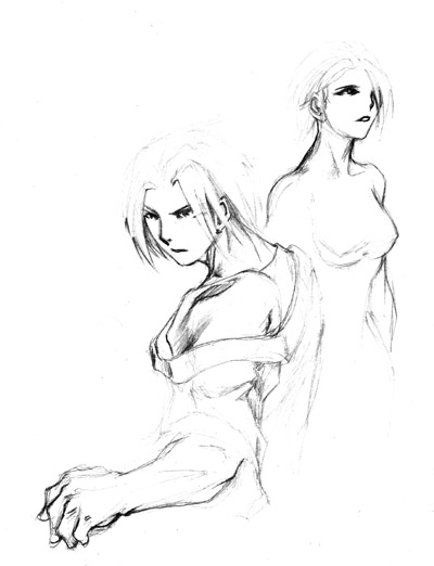
This is a sample of work that I did that goes against the "traditional" rules. Traditional rules would demand the lines on Moehre (the Mithra) to be thicker due to prespective: items that are closer are always sharper and darker. In a simple example: a black car in the distance will probably have a lighter tone as the dark green jacket on the foreground. That also means that the lines inside Moehre should NOT be all of the same thickness: shaded ares (like armpit) and objects in the foreground (like the sword) should be thicker.
BUT
If you notice closely, the lines on the Orc are actually thicker, and the abuse of the black on his clothing actually pulls the attention to his image. The idea behind is to drag a bit more violently the reading of the image from left to right (the way it would read in a Western country) emphasizing the dynamic of the jump of Moehre.

On this image, though, I was not looking for dynamic. I used a more traditional approach: the thicker lines are the ones responding to shaded areas (even though there is actually barely any shading colouring). It help creating a 3d effect on a very flat image in terms of perspective. A mixture of thicker lines and thinner lines also help greatly on the 3d modeling of tissue, like in the head of the puppet, but it also responds to the same ideal of shading.
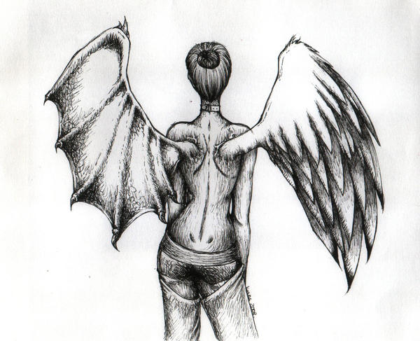
In the end it really depends on what you want to transmit. The image you posted it doesn't look odd to me at all. It looks to me you wanted to put into the foreground the human, putting the wyvern into the background of importance, even though in perspective they are equals.
Hope my wall of text makes sense (very late here, brain nt working well) and helps you in some way :)


")


